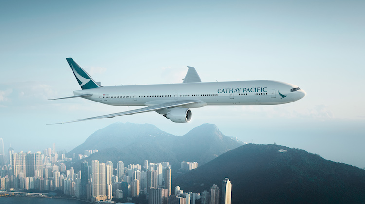
A new livery unveiled by Cathay Pacific will be progressively introduced onto all aircraft in its fleet as part of an overall revamp of the airline.
The livery was showcased yesterday on one of the airline’s Boeing 777-300ERs at Hong Kong international airport.
You might not notice the change instantly, because it’s a subtle change in the exterior designs, paint colors and logos, designed to update the Cathay Pacific brand for the future.
Ivan Chu, Cathay Pacific’s CEO, said that this new livery is a symbol of the company’s values; “the livery represents Cathay Pacific in and out of Hong Kong and every time our aircraft take off or touch down in our network of destinations around the world.”
Cathay says the livery represented a “timeless, yet contemporary, elegance” that blended the airline’s Asian roots with a global outlook.
Chu told guests at the official unveiling the updated livery was the latest initiative to “refresh” the airline’s brand identity over the past year which in addition to a new logo has also included new-look premium lounges both at its Hong Kong hub and in foreign ports, as well as a new website and mobile app.
“We are very happy and proud to unveil our new aircraft livery which represents our journey into the future and also celebrates the many great things we have achieved over the past seven decades as the home carrier of Hong Kong,” Chu said.
“This new look is the latest – and most significant – development in our ongoing efforts to improve the overall customer experience at Cathay Pacific. It is also a highly visible representation of the huge investments we are making in new aircraft and products as part of our ongoing commitment to build Hong Kong’s position as an international aviation hub.”

New changes in Cathay Pacific
The nose
At the nose, the brushwing has been increased in size, freed from the green band that used to surround the nose, and the position adjusted slightly. The Cathay Pacific name, or wordmark, now sits above the windows. The font is the same, but the letters are now all uppercase, so that the wordmark is more prominent. These changes make the aircraft easily identifiable as Cathay Pacific from the front.
The fuselage
A single grey band now runs down the fuselage, elegantly linking the nose with the tail. The band encapsulates the contemporary design approach that is at the heart of Cathay Pacific’s brand ethos, and yet is also a subtle echo of past liveries. Overall, these elements give a more contemporary feel, which is better aligned with the direction of Cathay Pacific’s overall brand redesign.
The tail
The tail now displays a brushwing against an all-green tail. This is the same green as on the previous livery, but now a colour gradient runs along the back edge of the tail, subtly deepening the tone of the green background in that area. Additionally, the brushwing appears ‘clipped’ at the back of the tail. This allows us to keep the brushwing prominent on differing tail proportions, for all types of aircraft.
Here’s the new look:


